In photography, we use composition, forced perspectives, or props to convey the contrasts in the picture. Photographs can also rely on the cultural ideas and identities of the viewers. [ExpertPhotography is supported by readers. Product links on ExpertPhotography are referral links. If you use one of these and buy something, we make a little bit of money. Need more info? See how it all works here.]
What Is Juxtaposition and What Are Juxtaposition Examples?
Juxtaposition happens when there are two or more elements in a scene that contrast with each other. Or one element contributes towards the other to create a theme. It’s all about making the viewer wonder why we chose a certain viewpoint for the picture. To create a point of juxtaposition, the picture must contain at least two elements with strong visual weight. The viewer looks at both of these at the same time, coming to a conclusion about the purpose of each element. What makes juxtaposition such an interesting compositional tool? It’s based on the chance appearances of two elements, although it can be forced at times. Some photos with juxtaposition need context to work. This sort of juxtaposition can work well in the right circumstances. But you need to make sure that the viewer is aware enough of the relevant information to understand it. When you start to include contrasting elements in a scene, things become a little bit more complicated. This is often where you’ll see forced juxtaposition.
Forcing Juxtaposition
It’s one thing to be aware that juxtaposition exists when you’re taking a picture. But it’s another to go looking for it. Anyone can sit outside a big bank and wait for a homeless person to walk past to take a photograph. That’s a matter of patience, not skill. The more you know about composition, the more you understand a scene just by looking at it. Understanding composition is the basis behind taking a good picture. The most subtle cases of juxtaposition result in stronger photos.
27 Juxtaposition Examples
Now check out our 27 examples of juxtaposition below. They can inspire you to create similar scenarios.
1. Animate vs Inanimate
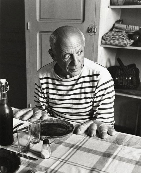
Yes, it is Picasso. It has Picasso sitting at a table, and bread rolls take the place of his hands. What makes this picture work is that it is subtle at first. Your focus places itself on his eyes and where his attention is going. What makes this a juxtapositional scene is that we see the unexpected. We see hands in the corner of our eyes, and it is when we focus our attention that we notice the conflict.
2. Big vs Small
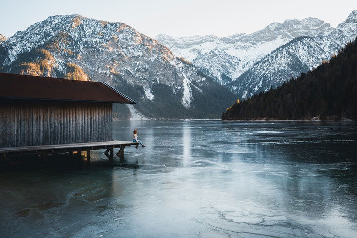
Basic examples of juxtaposition provide two conflicting ideas in one picture. We can do that with something such as size differences. We purposely include something big and something small. And we can strengthen this through the relationship between the subjects. Here the person is dwarfed by the huge mountains.
3. Big vs Small (Post-Editing)
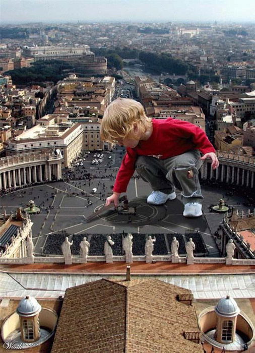
Another way to show size differences between two objects is by creating the effect in post-processing. Here, a photograph of a young boy is superimposed on top of a photograph of Rome. He becomes a Godzilla-like figure, terrorizing St. Peter’s Square.
4. Black vs White
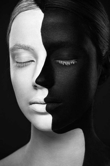
Colors are great examples of juxtaposition in photography. And there are no two colors that contrast better than black and white. This is because black and white have significance beyond their role as colors.
5. Fat vs Skinny
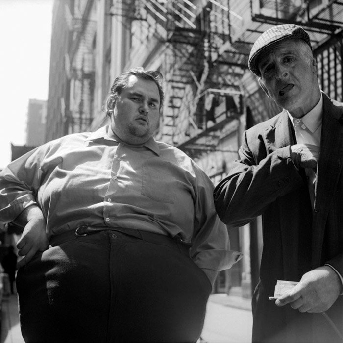
Another simple area to look at is the physicality of fat and skinny subjects. This can work with other objects, as long as you single them out in an otherwise busy image. The visual contrast and juxtaposition in this picture are undeniable.
6. Emotion vs Emotionless
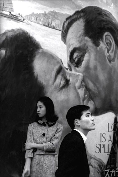
Photographers use the difference between foreground and background all the time. Here, we are using the foreground and background interactions as the juxtaposition. There’s the couple on the billboard kissing in the background. While the two in the foreground are facing away from each other.
7. Healthy vs Harmful
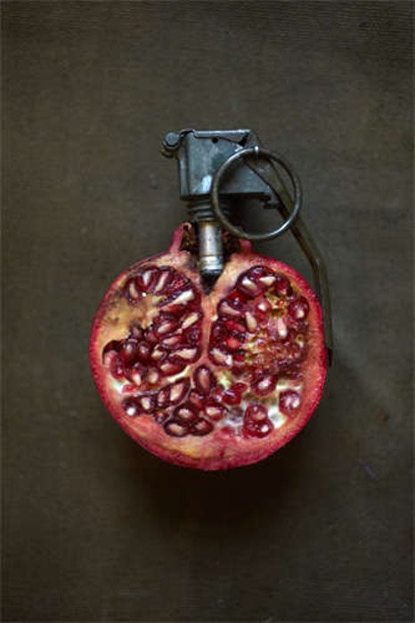
You can change a human’s perception of something using props. Here, the pomegranate has been turned into a grenade. This idea is very simple. Both objects look very similar to spherical shapes. But the meaning has changed entirely. Does the photographer want to convey that pomegranates can cause death? They do in the Greek myth of Persephone. They may be simply showing us the contrast between something healthy and something harmful.
8. Human vs Machine
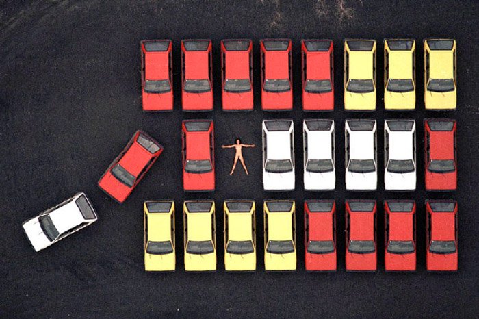
Juxtaposition can touch on the surreal. Here, we have an aerial photograph making use of patterns and juxtaposition. The gap in the puzzle breaks the pattern since we expect to see another car. And the nude person creates a contrast between the natural and the manmade.
9. Lines vs Circles
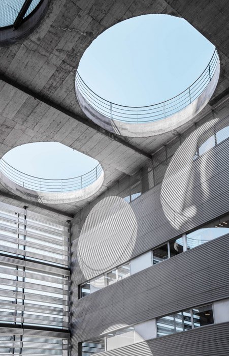
Shapes and forms serve as great ways to bring interest to a picture. They are inherently contrasting. Here, the shapes are not only from the holes in the ceiling. But from the shadows hitting the multitude of lines on the walls.
10. Mixed Concepts Juxtaposition Examples
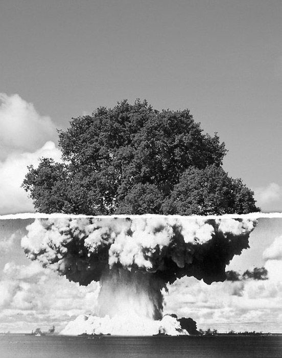
We can’t always find examples of juxtaposition in the world around us. Sometimes, we can create it during post-processing. Here, a picture of a tree and an atomic bomb mushroom cloud were merged. Death and life are in the same picture.
11. Natural vs Man-Made
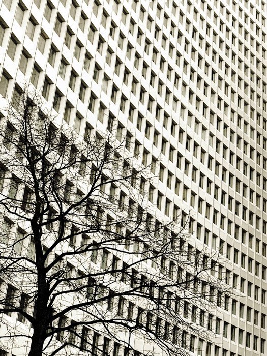
Our world consists of man-made and natural objects. It only fits to show these contrasts in our daily life. The picture below has a few juxtapositions. These make the picture visually striking. It shows us the manmade structure, with very clear-cut lines and perfectly repeated rectangles. This is in contrast to the bumpy curves of the tree. It also presents us with the idea of repetition. Every rectangle is exactly the same, yet each branch is unique.
12. New Technology vs Old Technology
Technology is another great way to show examples of juxtaposition. We create and develop technology so fast that it quickly outdates all past mechanical objects. Showing the difference between the old and the new tells us something about our society. The story behind the image is powerful.
13. New vs Old Architecture
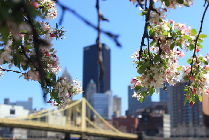
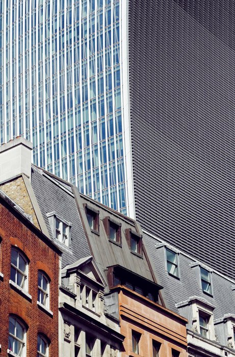
Architecture is almost inescapable. It tells us so much about the place and time of the taken picture. Consider the image below. We see the array of different architectural styles in the foreground. The huge skyscraper in the background overshadows these. Out with the old and in with the new.
14. Young vs Old
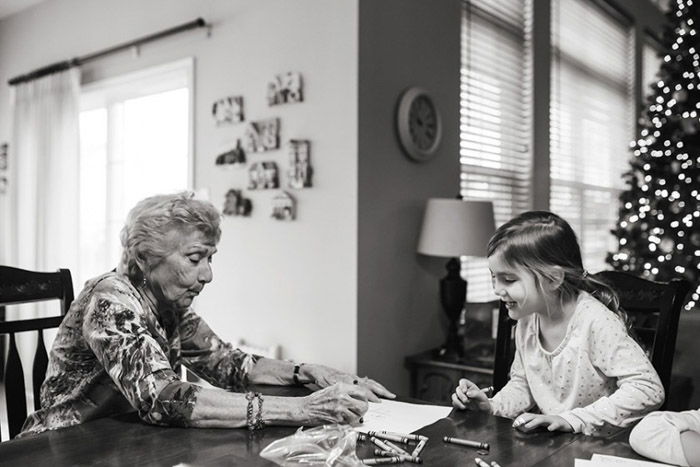
Nothing tugs our heartstrings more than images that show old and young humans. We see the passing of information, cultures, and traditions through their interactions. A gentle reminder that life is fleeting and time flies by so very fast.
15. Patterns and Colors
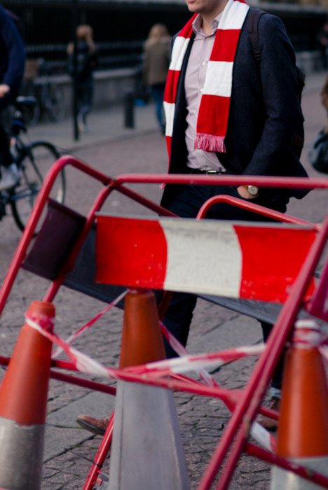
Patterns and colors are a basic but striking way to show juxtaposition in photography. In the image below, the photographer managed to capture a scarf that resembles the environment in the road work barriers and tape. The colors and patterns may be the same, but the juxtaposition comes from the use of the objects. You can find lots of juxtapositions when shooting street photography.
16. People vs Warfare
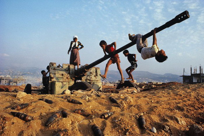
Documentary photographers find ways to incorporate humans and their settings to form a story. Here, children play around with a disused and abandoned artillery weapon. An object of death and destruction has become an object of play, laughter, and joy.
17. People vs Perception
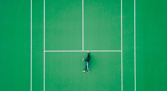
This is among my favorite photographs. It makes us think. It is a very simple image, captured from the air, showing a man holding onto a “ledge” for dear life. After a few seconds, we realize the obvious background. It is a tennis court, and we have been duped. Again, the setting has been repurposed, changing our idea of the area and using it for different means. Bravo!
18. Wealth vs Poverty
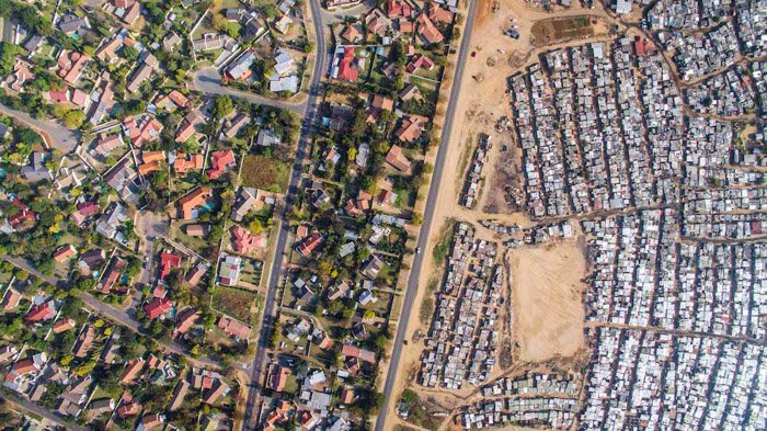
An area that many photographers like to cover is that of wealth vs poverty. It is social commentary at its most basic and most powerful. It is something that we can all acknowledge because it’s a global problem. This photographer aimed to show these contrasting elements through aerial photography. You can see the difference between the densely populated area vs the sparser and greener area to the left.
19. Poverty vs Idealism
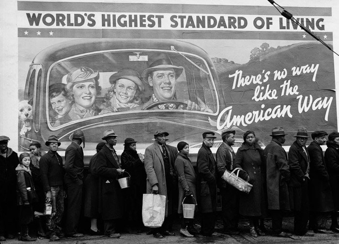
Billboards are a great way to show the state of the country the image was taken in. They serve as backdrops to products, services, and public announcements. Here, the billboard proudly states that this country has the “world’s highest standard of living.” And in the foreground, one sees many people queuing for food. Otherwise known as a breadline. And the happy people in the background are all white, whereas the entire breadline is made up of people of color. This screams volumes.
20. Repurposing Juxtapositions
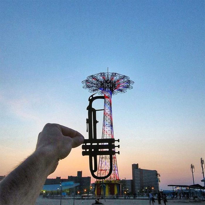
This image is amazing. The photographer extends his arm and places a cutout version of a trumpet in front of the lens while photographing. He repurposes the object in front of him into something different. While he is showing us how he did it. We see both objects separately, but also together, creating a new and third object.
21. Role Replacement Juxtaposition
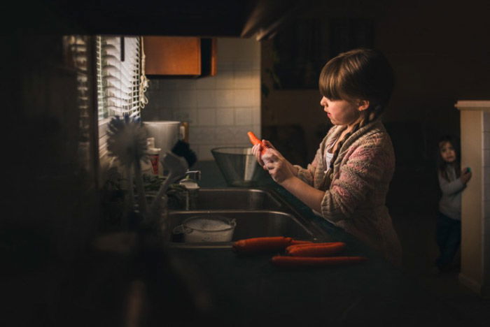
Juxtapositions don’t have to come from what is in front of the lens. It’s often about the concept and story of the image. Here, we see a little girl preparing food by peeling carrots. It suggests that the girl has taken the role of a mother. She is preparing food for the younger sibling seen in the background. We expect to see an adult doing that job. When the girl takes the adult’s place, we read much more into the image.
22. Straight vs Curved
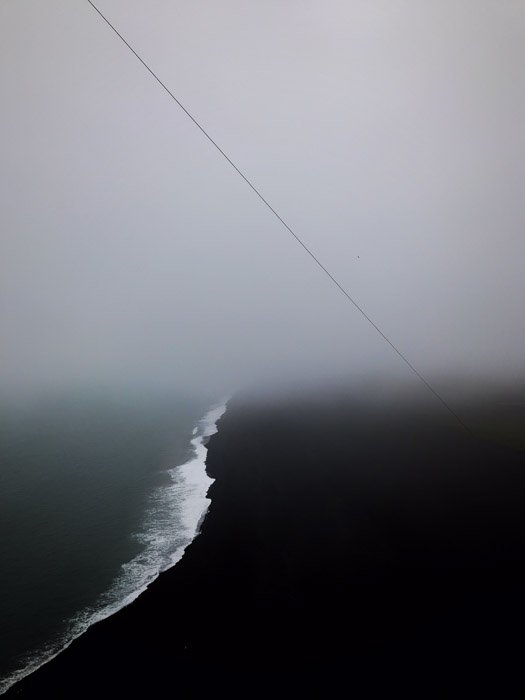
Lines can be very effective. Here we see a very minimal image of a straight and taut line juxtaposed with the curved line of the water. The colors and atmosphere of the image also work as a contrast to each other. The black line sits on a lighter background. Whereas the white from the water exists in a darker area.
23. Power vs Weakness
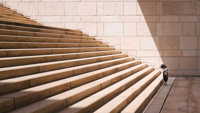
I love images with single subjects. They help to give the scene a sense of scale. Without this little boy, we wouldn’t have a clue about how big those steps are, or if they are in fact steps at all. The boy looks at the first step, where we see many more ahead of him. It is a powerful image of the strong and prominent lines in contrast to the small boy, momentarily too small to climb them. Some day, kiddo.
24. Vintage vs Modern
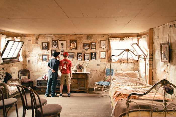
We are in love with vintage objects and scenes. If you don’t believe me, look at fashion, art, architecture, and music. You name it, we have a retro version of it. It teaches the younger generations what life used to be like through objects, styles, colors, and patterns. Here, we see two boys in modern-era clothes looking around a vintage room. The furniture and the atmosphere feel very old, and without the two boys, it would be a timeless image.
25. Past vs Present
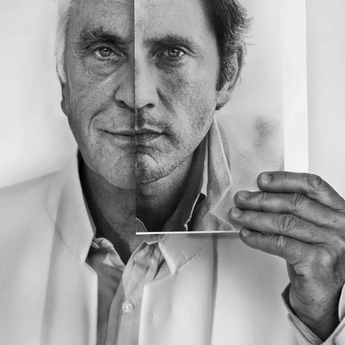
This image of Terence Stamp—a renowned stage and film actor—is one of power. We have his modern portrait on the left, while a younger version of him sits on the right. He is using an old image to both hide and present the two halves of his face. We can compare and contrast the differences in the two parts of his face, seeing how life and old age have treated him.
26. Expected vs Actual Size
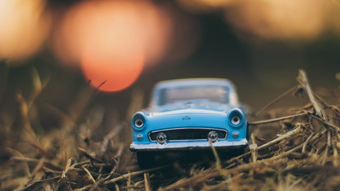
Here we have another juxtaposition example of expectation. We see the object as a real, life-sized car, not a toy. On closer inspection, we look at the environment and realize that these are twigs. The car is much smaller than we expected it to be. The shallow depth of field helps to create this effect.
27. Stereotypes Juxtapositions
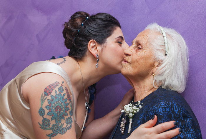
Every culture and group of people in the world uses stereotypes. These can be about gender, color, culture, and traditions of other groups of people. Here, the woman on the left has tattoos, which are sometimes seen as crude by older generations. However, the woman is elegantly dressed and embracing her grandmother. It can be interesting to evoke these thoughts in your viewers.
Conclusion
Juxtaposition examples are everywhere, you just need to find them. Look for them in your environment or when shooting street photography. Capture them and make the viewer look at your pictures for longer.
