1. Types Of Product Photography: Simple Studio Product Shots
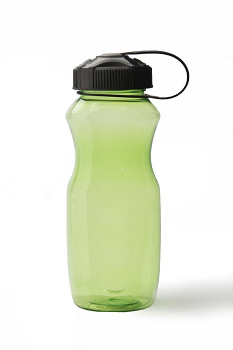
Product photography is hotter than ever, and the reason is simple. In our world of online shopping, where millions of products sell online, there’s a great need for good, clean, product photography. Different types of product photography will require different approaches to showcase the particular product. A bottle of perfume for example, will require a different lighting approach than product packaging. This is because the surfaces of the products are different. For online retailers who sell a diversity of products, speed and efficiency are necessary when it comes to creating product images that will sell the product. This could mean that they have a studio setup that does not move. All products are shot with the same static setup. This water bottle is a perfect example of a simple lighting setup on a white background. It clearly shows the shape of the product. Using the white background allows the plastic to show its translucency and green color. This product photo clearly tells the shopper what the product is made of and what it looks like. Consider as well, that in today’s retail markets, buying in a local retail store allows the shopper to hold, touch, and feel the product. The online shopper does not have that option. A clear product image is crucial to selling that product online.
2. White Background Photos
3. Using Scale to Show the Size of the Product
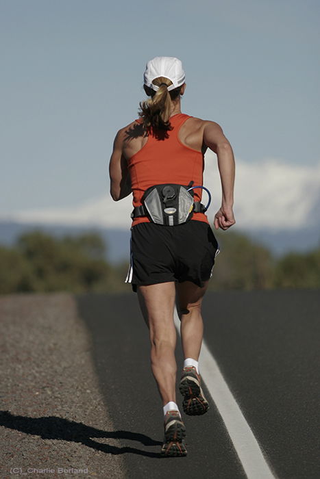
Creating scale is a photography approach that defines for the viewer, how big or small a product is. It allows the shopper to view how the product looks and is used. This runner is wearing a hydrating fanny pack. The size of the product in relation to the size of the runner, tells the viewer all they need to know about the product’s size. It helps them visualise how the same product might work for them.
4. Product Grouping
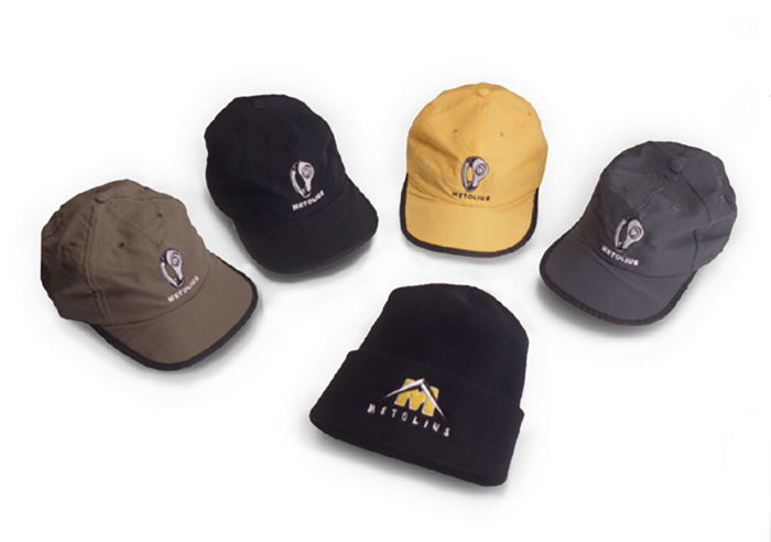
Group product images are a way to demonstrate options to the buyer. These can be a collection of women’s make-up that might include multiple variations on the products in the group or the same product that comes in variations. This grouping of hats shows two styles and a variety of colors. A grouping is a way to depict the shape, variety, and the size of the products in one product photo.
5. Products and Lifestyle Action Shots
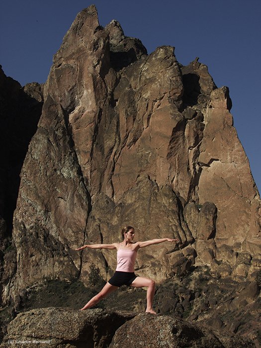
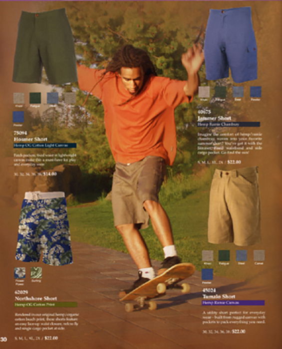
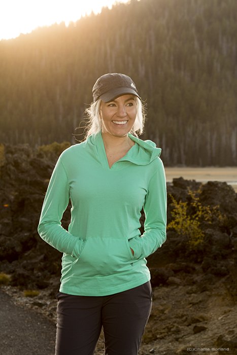
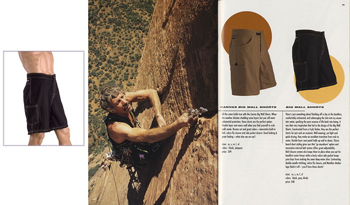
‘In-context’ product photographs show the product used in a manner they were designed for. This woman, photographed for a yoga clothing catalog, is wearing yoga clothing. I photographed her performing yoga in a park, demonstrating how the products fit her. Some designers will create a catalog, or webpage, showing the product and the in-context aspect of the product in use. Here we photographed the skateboarder outdoors and later photographed the various colors of the shorts in the studio against white. The designer then ‘knocked-out’ the shorts from the white background and overlaid them next to the action photo of the skateboarder. This approach allows the shopper to see the product itself, and how the product looks while in use. Lifestyle product images are similar to in-context action product photos. Here, the model is outdoors but we do not know much more than that, like where or why. It is all about her and the product she is wearing in the outdoors. This guides the viewers to focus on the product only, allowing them to decide if the product is what they want.
7. Studio Setups
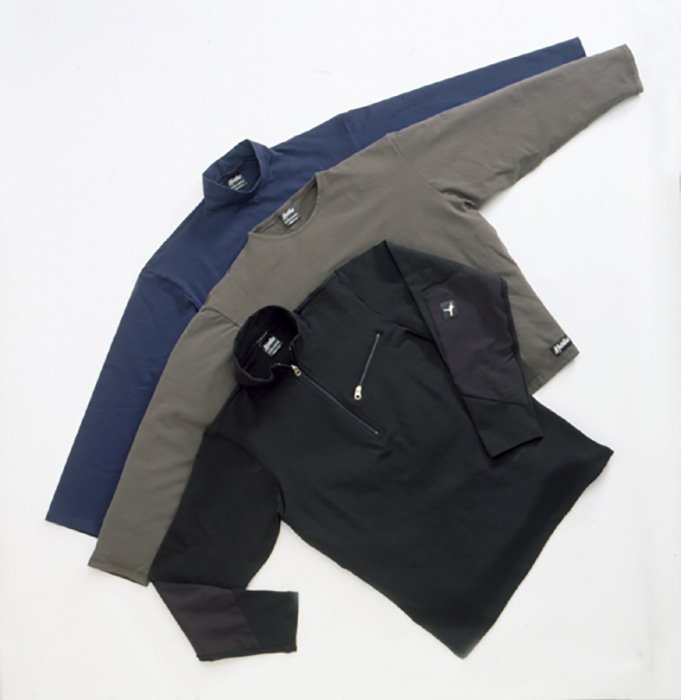
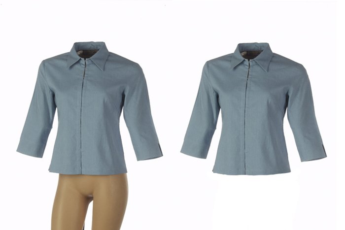
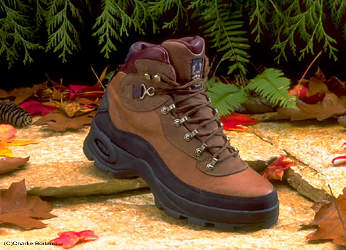
Many products are shot in the studio and the primary reason is total control. You can place your product in a position to photograph it and not be concerned with the wind blowing something over. Or you can create a setup that will not change while you move products in and out, photographing each arrangement. Just as important when photographing volume products, is creating a lighting setup that will require little change while you fine-tune your product to make them just right. ‘Lay-downs’ are a fairly common method for staging apparel. They work well and are a common photography technique due to the quick setup. The camera angle is from above looking down. It allows us to position each product as desired or overlapping as seen here. What’s lacking with the lay-down approach is the 3-dimensional appearance of the apparel itself. Using mannequins to showcase apparel provides a more 3-dimensional appearance to the product. Mannequins come in a variety of sizes and body shapes and allow different poses to best showcase the apparel. In this example, we placed the shorts on the mannequin and then lit them with studio lighting to further enhance the 3-dimensional look. The designer then cut out the shorts and placed the product image into the catalog layout. Small sets staged in the studio are another approach to make the product seem to be in a specific environment and in this case, the outdoors. I got the stone slabs from a decorative rock company while the fall leaves came from an art supply store. These items remain in our prop room in the studio. We can use them on various shoots as needed. I collected the ferns and cedar branches in a local park for this shoot. The final image is a clear studio product shot with an outdoor feel to it.
8. Non-Traditional Product Images
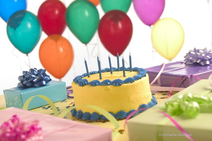
Occasionally, there is a need for product photos that don’t showcase a product. These are set up, lit, and staged just like a product photo featuring a product, but there is no specific product in the image. These types of product photography do not sell a product but rather sells an idea. These wrapped presents represent the idea of gift or gift wrapping. There is no product specifically for sale. But stores can use this image to promote their Black Friday or Holiday sales and gift-wrapping services. This product photoshoot was created with the same concept, except, it represents celebrations like birthdays, anniversaries, etc. There is nothing specifically for sale in this product photo, yet this image conveys celebration. Clients can use it for anything where cake and gifts are part of the event. In another product photo that does not promote a product, this image is part of a series of images for a golf course. The advertising theme was TIME, where each ad mentioned something about time.
9. Hanging Products
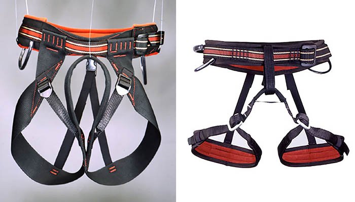
Like the mannequin used for apparel, you can hang some products to make them appear more 3-dimensional. I hung these rock climbing harnesses from several poles using a fishing line. By moving the poles further apart, the harness appears more 3-dimensional. Then using Photoshop, the graphic designer removes the background and fishing line for a 3-dimensional, floating look as seen on the right.
10. Large Products
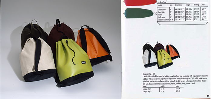
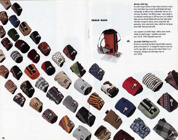
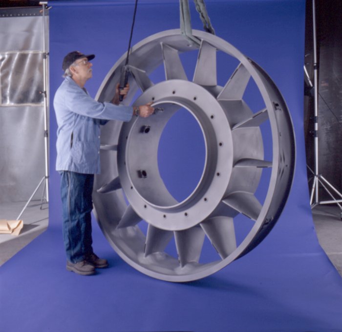
Large products can present some challenges depending on their size and weight, and the ultimate purpose for the product image. Depending on the product, the location, the lighting, and shooting strategy may be similar to smaller products, but on a bigger scale. This group product photo of climbing chalk bags was photographed as one product photo. While it would have been easier to create a small setup and photograph each bag individually, the art director wanted one photo containing all of the bags. The first reason is the effort to add each bag’s photo one at a time into the layout vs. one photo containing all the bags. The other reason was the ad’s concept was showing all bags leading away. Photographing each bag individually would have required an adjustment, or a guess, of how to mimic the perspective for each bag. That was not feasible, so the bags were laid on a white seamless background, on the floor. I then used an extension ladder to climb up high enough to get all bags into the camera frame. This industrial casting weighs ‘a ton’. Bringing it to the studio was not an option. Instead, we went to the factory and set up our blue background and lights. The operator, brought the casting over with a ceiling crane and lowered down to the floor on our background. This is the photo that we delivered to the designer, who then retouched out the strap holding the casting and extended the blue background left and right. As I mentioned, these large product photos often use the same lighting strategies as most products, but on a bigger scale. For example, this product is large and requires an approach using larger light sources. While lightboxes work great for many smaller products, the size of this product demands a larger soft-light source. If you look at the casting you can see the highlights are even across the entire casting. If you used a small lightbox for example, the highlight would only cover a portion of the casting. Instead, we used a 6’x6’ translucent light panel. By bringing that panel right up close to the product, then positioning a strobe light behind, the highlight is even across the casting. The light source is now equal to the product size. The key point for this type of product: the size of the light source should match the size of the product for even highlights across!
Conclusion

